Storybook integration for next-intl
Source URL: https://next-intl.dev/docs/workflows/storybook
Storybook integration for next-intl
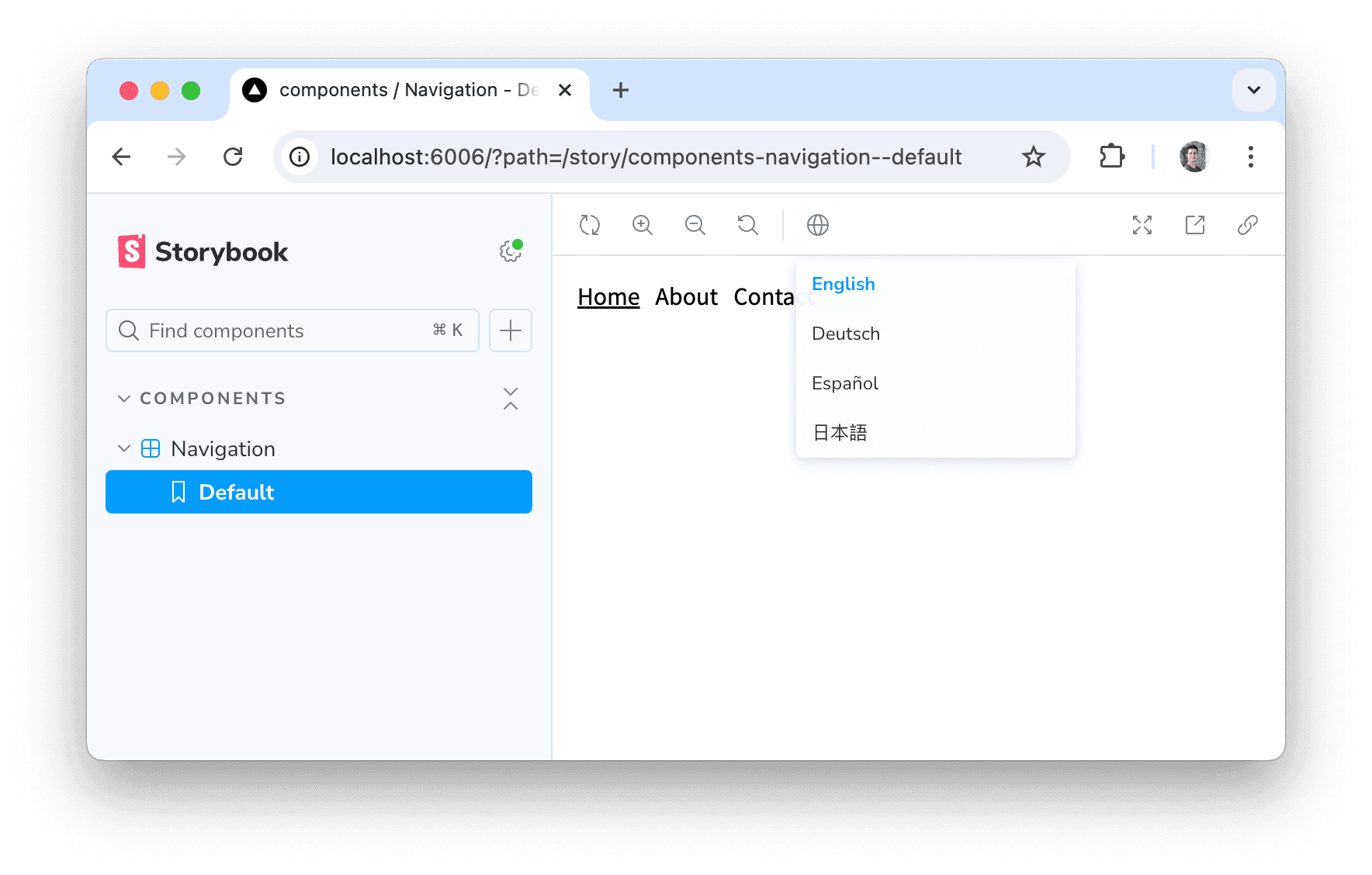
Section titled “Storybook integration for next-intl”Storybook is a tool for developing UI components in isolation and can be used in combination with next-intl to handle components that rely on internationalization.
Manual setup
Section titled “Manual setup”To set up Storybook for next-intl, you can configure a global decorator that renders NextIntlClientProvider to wrap your stories accordingly:
.storybook/preview.tsx
    import {Preview} from '@storybook/react';    import defaultMessages from '../messages/en.json';
    const preview: Preview = {      decorators: [        (Story) => (        )      ]    };
    export default preview;
With this setup in place, you’re able to render components that use hook-based APIs like useTranslations.
Note that support for async Server Components is currently experimental in Storybook and might require additional configuration.
💡
Tip: If you declare components that render as Server Components in your app via non-async components, these components can render as Client Components in Storybook and will consume configuration from NextIntlClientProvider.
storybook-next-intl
Section titled “storybook-next-intl”Alternatively to setting up the global decorator yourself, you can use storybook-next-intl, a community-maintained addon that configures Storybook accordingly for you.
Features
- Sets up
NextIntlClientProviderglobally for you - Provides a locale switcher so you can test components with different locales